My role
What I led
I owned the product design from research to handoff. I led the move from a paper-based training process to an LMS, and the introduction of immersive VR so engineers could rehearse dangerous procedures before doing them for real.
Working from the company’s existing brand book, I built a dedicated design system on top of it, so the LMS, the admin console and the VR flows all shared one consistent set of components and tokens. I designed to WCAG AA, checking colour contrast, focus states and legible type, so a platform whose whole job is clarity stayed readable for everyone.
The problem
Critical training, delivered in the most inconvenient way
Engineers can’t work on an industrial site until their safety training is current, so the platform that manages that training, courses, exams, VR drills, certificates, sits directly between a person and a dangerous job. Getting it right matters. The problem was that it was still run the old way: heavy on paperwork, and hard to keep on top of. Around the training itself, HR managers also manage the licenses and seats that keep it running, so that had to live in the platform too.
Field training did happen, but only as a group session run once per topic, so an engineer got a single shot at it and a lot of material to learn by heart beforehand. The challenge wasn’t the features. It was that the training was critical but inconvenient for everyone it touched. HR managers led the whole process while buried in it, and needed to see who was behind without hunting through lists. Engineers took it seriously but faced stacks of paper to memorise before a one-time session, with no way to practise or repeat it. The rebuild had to keep the training just as rigorous while making it easier to run, and letting engineers rehearse before the real thing. So before designing a single screen, I went and talked to both sides.
Research
Eleven interviews, two very different users
I interviewed 5 HR and L&D HR managers and 6 engineers myself. I wanted the same thing from both: what does your day actually look like, where does this training fit into it, and what frustrated them about it.
11 interviews
5 HR managers and 6 engineers, to hear how training fits their day and what frustrated them about it.
Behavioural data
Completion, compliance and time-on-task, to see where training lapsed and how people actually did it.
What I heard
The pains behind the resistance
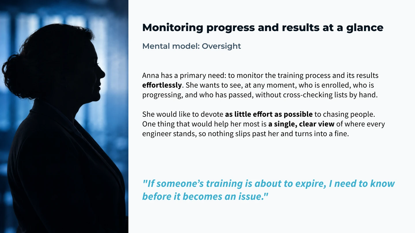
Manager pains
- No single view of who was at risk of missing a deadline, so problems surfaced too late.
- Hours lost to manual chasing: cross-checking lists, sending reminders one by one.
- No easy way to prove compliance when it was asked for.
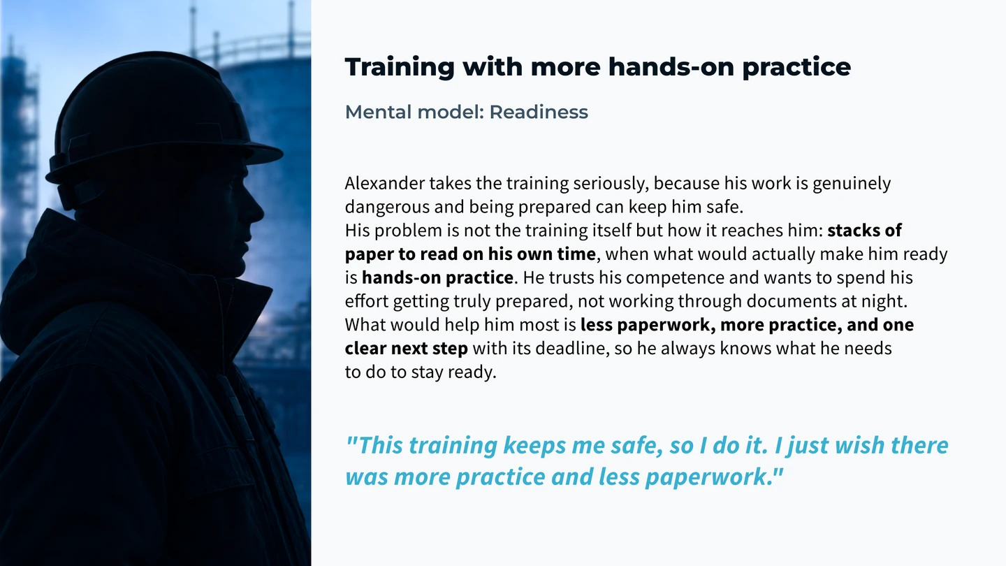
Engineer pains
- Never sure what was actually required of them right now versus later.
- Training felt like an open-ended interruption with no clear end.
- Getting nudged about things they’d already done, which eroded any trust in the system.
The insight that shaped everything: both users were resisting the same thing, a system that made them do the work of finding information. The HR manager had to hunt for who was behind. The engineer had to figure out what was required. Neither should have had to. The platform should surface it.
The solution
One platform, built around each user’s first question
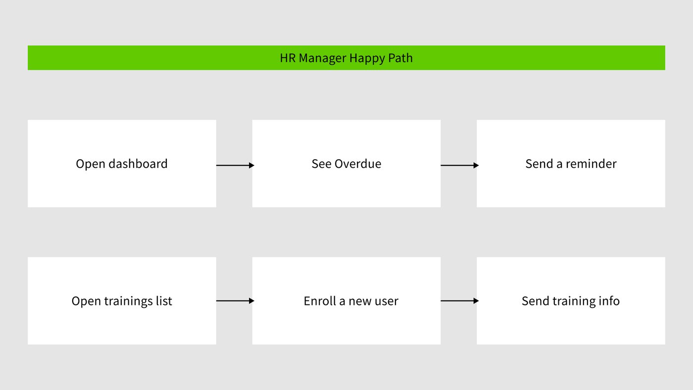
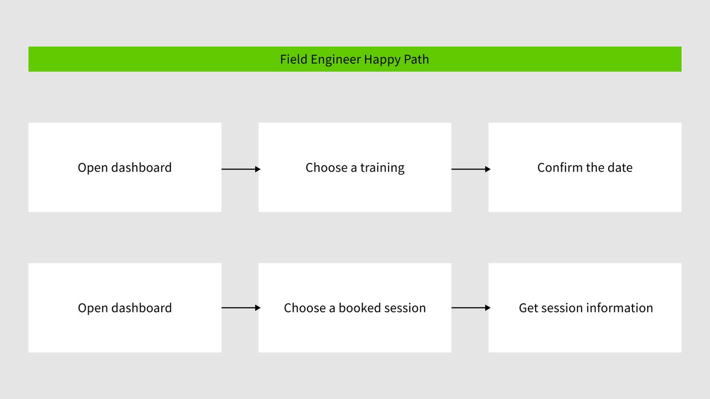
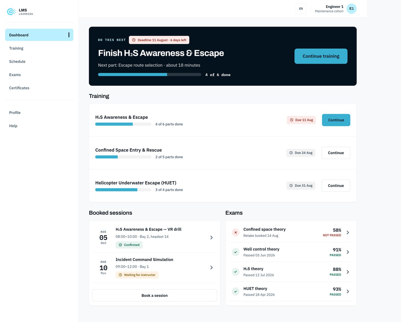
The two users open the platform needing different things, so I gave each their own starting point. The HR manager lands on “who is behind,” the overview needed to keep the process on track, with every existing training laid out clearly and enrolling reduced to a couple of clicks. The engineer lands on “what do I do next,” the single step that gets them ready without wading through everything else. And instead of memorising paper for a one-time session, the engineer can now rehearse the procedure in VR and repeat it until it sticks, which was their biggest ask. Each side is arranged behind that one question, and each has its own flow.
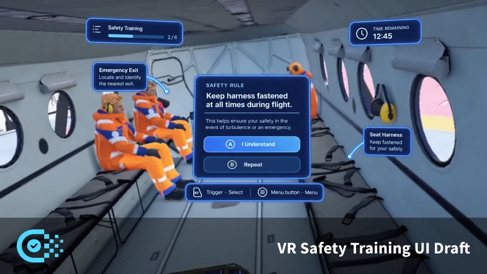
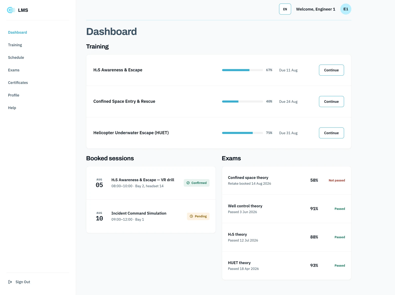
The original, 2021
What I shipped
The first version put the research into practice: a clean, role-aware platform that moved training off paper and into one place. HR managers got a clear view of courses and could handle billing and seats without the clutter of the old internal tools, and engineers got a straightforward path through what they had to complete. It was a solid, legible product that made a heavy, paper-bound process far easier to run.
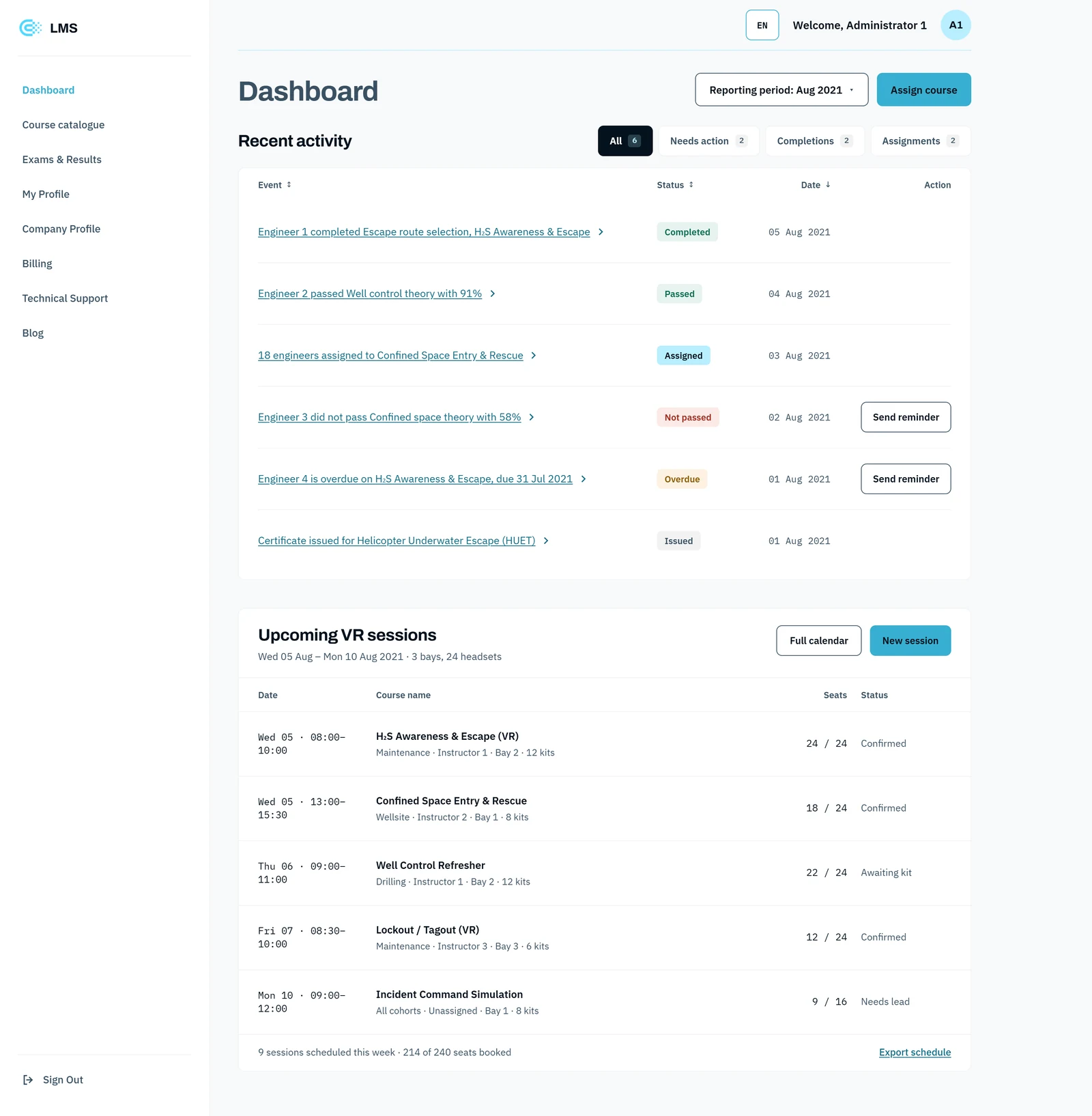
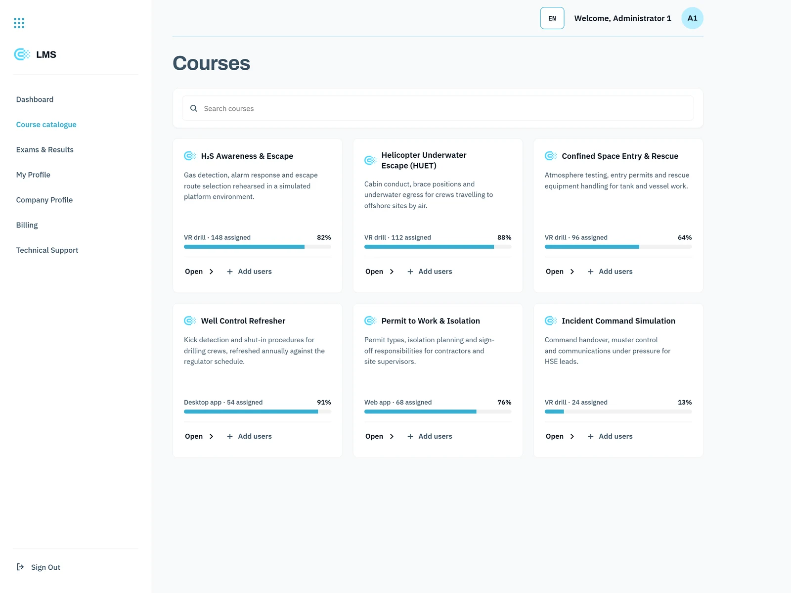
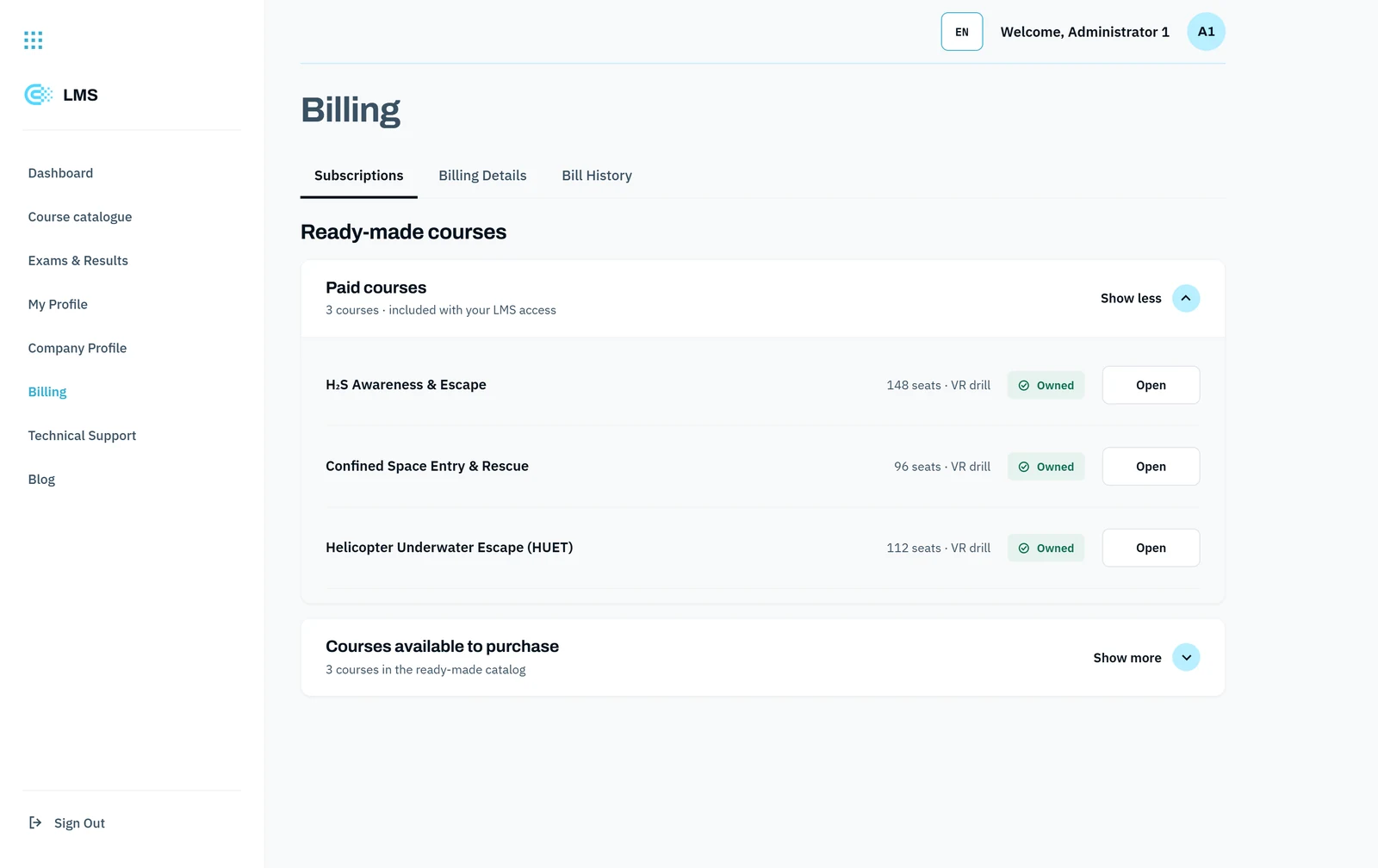
2026 redesign
Revisiting it with AI in the loop
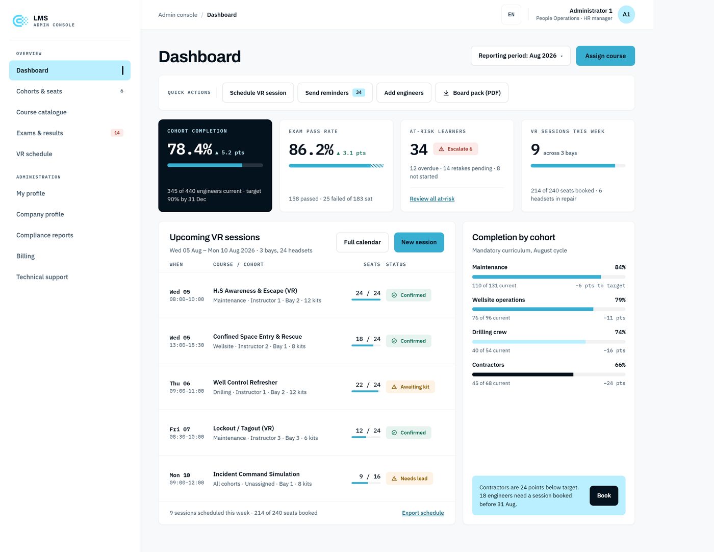
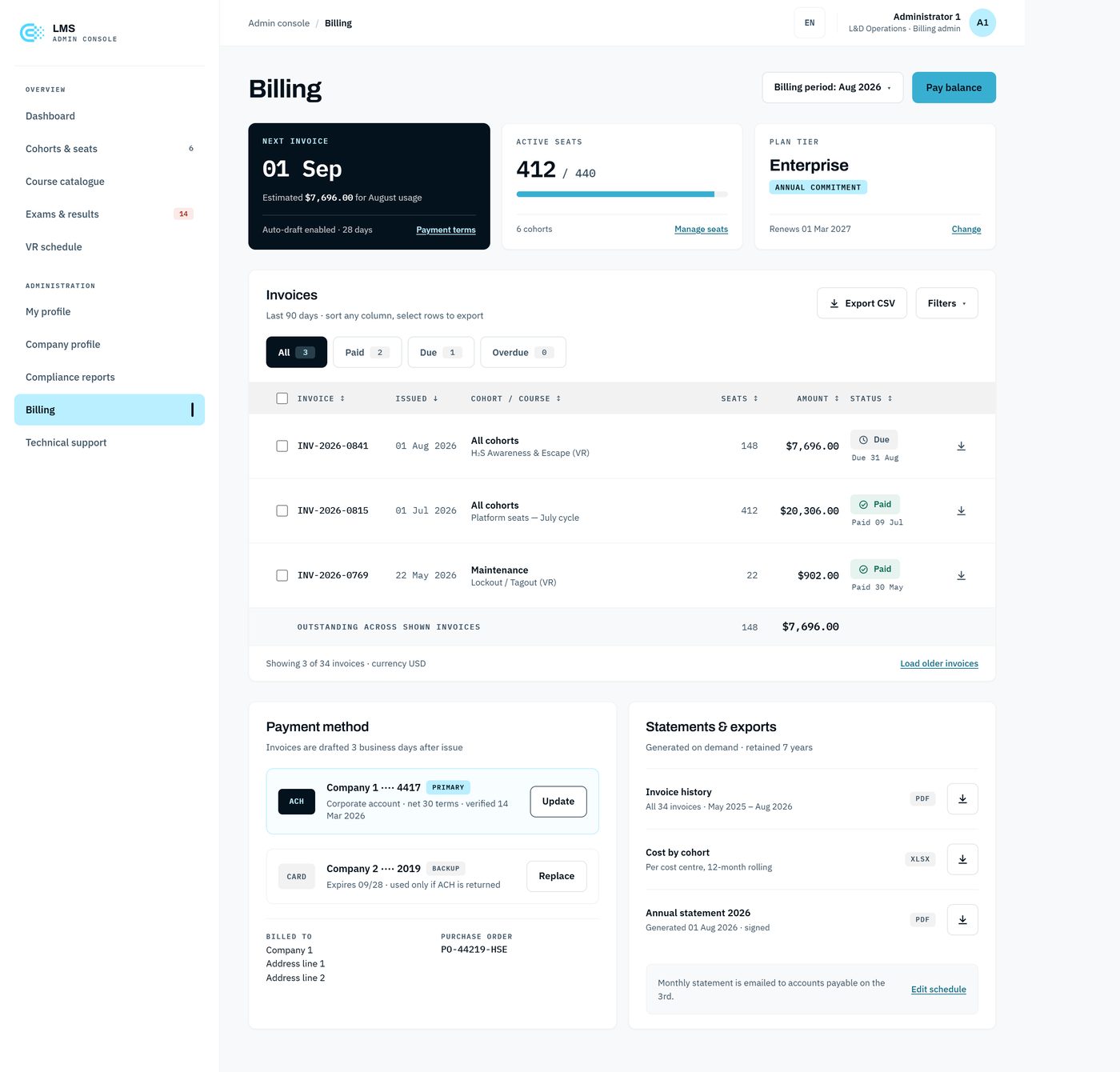
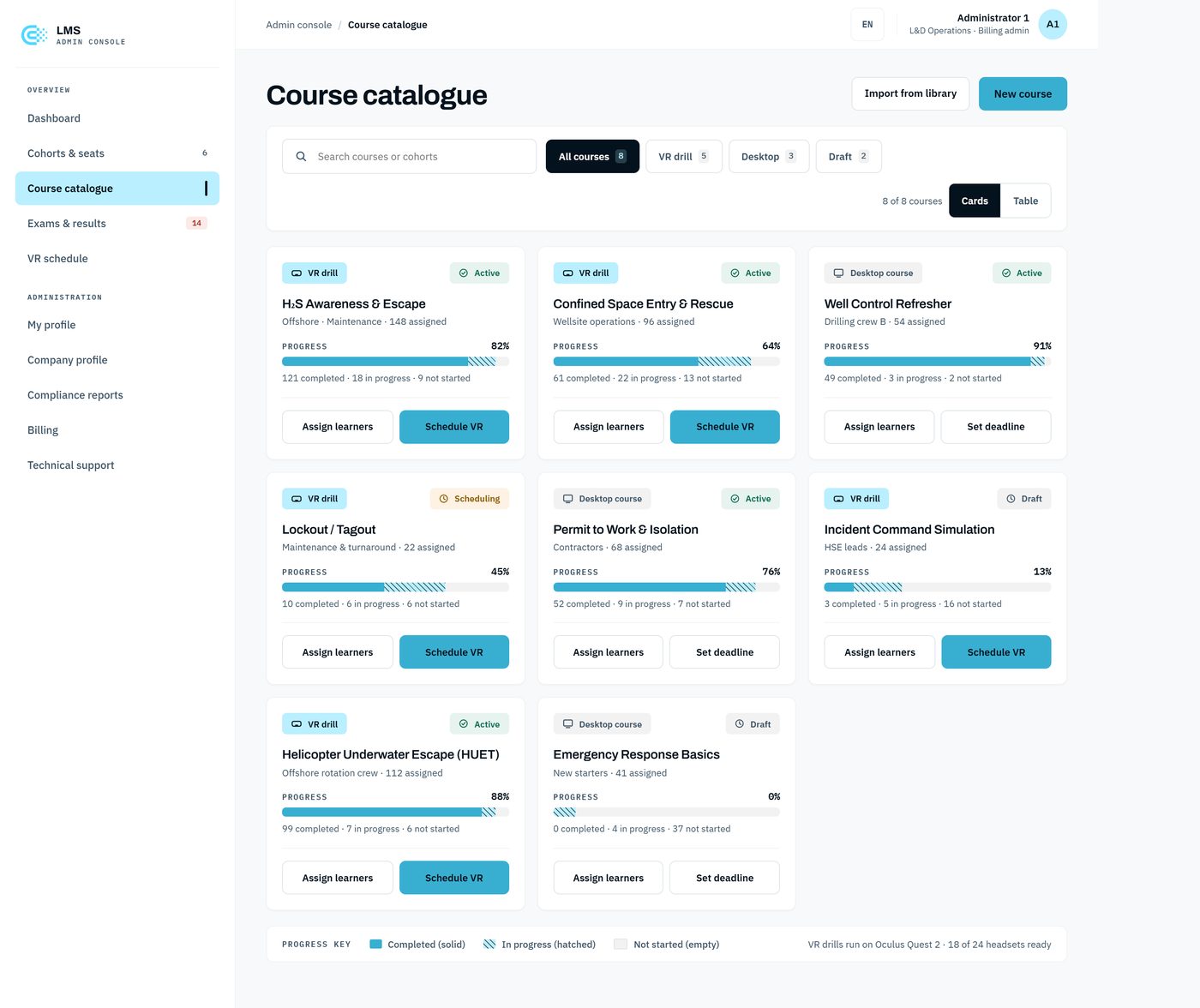
Years later I came back to the same product to push it further, and used AI to move faster through the parts that usually slow a redesign down. The goal was a denser, more functional interface that surfaced even more of what each user needed, without losing the legibility of the original.
- Research, sped up. AI helped me run a quick competitive and heuristic pass over other admin and LMS tools, and cluster the findings, so I spent the time deciding rather than gathering.
- Layout exploration. I used AI to generate dense-dashboard layout variations quickly, then chose and refined the direction. It made the wide, cheap part of the work faster.
- Design-system structure. AI helped scaffold the token and component taxonomy, colour, spacing, type, and panel states, which I then judged, corrected, and finalised into the system the new screens run on.
The split that kept it honest: AI did the fast first pass, gathering, generating, scaffolding. The judgement, the information hierarchy, and the final calls stayed mine.
Pilot results
Measured against safety, not engagement
The platform ran as a six-month pilot. The numbers that matter aren’t logins, they’re how much time and cost the design gave back to the people using it.
Everything the research pointed to, surfacing progress for the HR manager and the next step for the engineer, was aimed at getting the right training to the right person with less effort on both sides. The time and cost savings came from the same place: both users stopped hunting for information the system should have shown them.
What I took from it
Three things I design by now
Start with the people, not the features
Both users took the training seriously; it was the process around it that got in their way. Interviewing them turned that friction into the brief, and the design came straight out of what they found hard.
Design each role around its first question
The HR manager asks who is behind; the engineer asks what’s next. Two users, two starting points, two flows. One shared view would have served neither well.
Let people practise, not just read
The engineers’ biggest ask was to rehearse before the real thing, not memorise paper for a one-time session. Moving critical training into VR is what made it both safer to learn and easier to keep current.