The brief
Nothing to build on
Liberty Harbor is a base you build inside World of Warships. Five areas, each doing a different job, all feeding one progress bar. Fill the bar and you win a ship.
There was no earlier version to improve. Nothing in the game worked like it. So the shape of it was mine to decide, and I had four hard limits to work inside.
No design system.
The main game's component library was off limits, and blur effects weren't technically possible. I built everything from scratch.
The 3D scene never goes away.
The harbour stays visible at all times, so full-screen modals were out. Every interaction had to live in a panel on top of it.
Some choices can't be undone.
A wrong upgrade can cost premium currency, which turns a design mistake into a real cost for the player.
Five months, two of them mine.
Design and research had two months, inside a five-month build, across a team of forty.
Building the system
Tokens before screens
With no library to borrow from, the first thing I built wasn't a screen. It was the set of rules everything else would follow: colour, type, spacing, and every state a panel could be in.
The states mattered more than usual here. Because a wrong upgrade could cost real currency, I mapped locked, active, completed and error before any of it reached a developer, and made sure the cost of a choice was visible at the moment you make it, not buried in a dialog you might click past.
Panel states
Locked
Not yet available - shows what unlocks it
Active
In progress, currently interactive
Completed
Done - reward already claimed
Error
Blocked or over-cost, needs attention
base surface #262D38 · all tab tokens composite over it
tab / primary
#000000 50%#000000 40%#000000 30%tab / action in progress
#295270 40%#295270 30%#295270 10%With blur unavailable, I used separate hues rather than opacity alone, so panel states stay legible against the moving 3D scene.
24 / 600Panel title18 / 600Header16 / 500Subheader14 / 400Body: requirements, rewards, descriptions481216243248Scoped token layer built from scratch, since the main game's design system was unavailable.
Process · Research
I tested the prototype, and most of it failed
There was no data to start from. No previous version of this feature, nothing internal to benchmark against. So I did two things: I looked at games that had already solved my exact problems, and then I tested my own prototype with real players before we built it.
Then I tested it
I ran a moderated UX test on the prototype with 5-6 experienced players. Before the sessions I wrote out what I expected players to understand on each screen, so the results could be scored rather than argued about.
Lobby
Naval Command
Fuel Terminal
Military Port
What I learned from it
The pattern was hard to miss. Anything players already knew from the main game, they understood straight away. Expedition requirements, assembling an expedition, reading ship tiers: all supported, because they had seen those patterns before.
Anything new failed. Overcharge, Fleet Power, the mission counter, the status icons. Players didn't just find them difficult, they often didn't see them at all.
This is what changed my approach. The problem was never that the interactions were too complex. It was that new concepts had no way in. So instead of simplifying the deep mechanics, I focused on making things recognisable, and on teaching through doing rather than through text that nobody reads.
Process · What I changed
Almost everything led to one fix
Looking at the failed hypotheses together, they were all the same problem wearing different clothes. Players weren't confused by the mechanics. They just never learned them, because nothing taught them, and the things that were supposed to teach them were text nobody read.
So instead of patching six separate elements, I built an onboarding flow that walks players through the important moments by making them do the thing, not read about it.
Players missed the Rules icon entirely. It looked secondary.
Replaced it with an onboarding flow. Rather than dumping the rules on players up front, it highlights one moment at a time. The first expedition is a guided one: you click, you assemble it, and you have learned the mechanic by using it.
Players couldn't find the Overcharge zone. They overlooked it in the menu.
Surfaced it directly in the onboarding, so players are shown where it is instead of expected to find it.
Players didn't notice the Fleet Power bar, and didn't know what it meant when they did.
Explained in onboarding, at the point where it matters: while assembling that first expedition.
Players missed the “Assemble all” button.
Highlighted in onboarding as part of the guided flow.
Players didn't understand the upgrade system. They didn't notice the button, and didn't know what unlocked what.
Made the upgrade path more visible, and built the flow so players have to use it once. After that, they know it exists.
Information is not learning.
Players had been given the information. They still didn't know how the feature worked. What changed things was letting them learn by doing one small version of the real task.
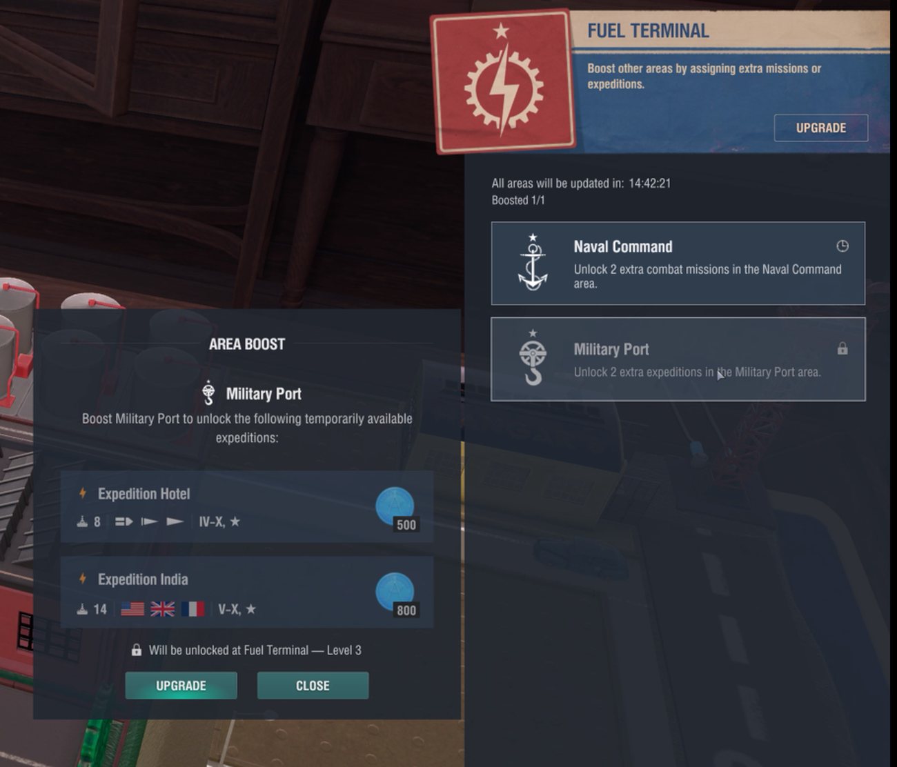
In the product
Upgrade path: the Fuel Terminal area boost. The locked Military Port states exactly what unlocks it, and the panel shows what you get for it.
Cost and reward sit together at the moment of the decision - not buried in a dialog you might click past.
After release
What the players actually did
Once the feature was live, I worked with the UX research and BI teams on a post-release analysis. This is the part I care most about, because it told me which of my decisions were right and which weren't.
said the rewards were clear and took little effort
What I took from it
Three things I design by now
Let people learn by doing
One guided pass through the real task teaches more than any amount of explanation. Wherever the first action decides whether someone comes back, build the first action, not the manual.
Borrow the mental model people already have
Familiar patterns work instantly. New ones ask someone to learn something at the exact moment they are trying to act. Consistency is a design decision, not a compromise.
Show the cost at the decision
When a choice is expensive and can't be undone, the price belongs in front of the person making it. That holds whether they are upgrading a ship or moving money.